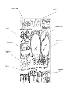
 This is the rough draft of our TV magazine front cover, which we have chosen to use the conventions of other magazine front covers to guide us and make our magazine follow the forms of current front covers.
We chose to have a rather basic layout, using most of the characters from the soap trailer and spacing them quite close together as this is done with other magazines such as TV Choice.
We also decided to have characters from the main love storyline as the main images, in the middle of the magazine to emphasise their importance. By having the statement 'I'm done!' right across the front it catches the audiences eye and by making this a bright colour such as yellow it really stands out.
No comments:
Post a Comment