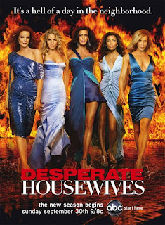
Here we see a poster for the new season of 'Desperate Housewives', using all 5 main characters together, all standing at an equal height. Even though Eva Longoria, for example,is really short in real life, she has been altered to look like she's of similar height as the others, giving them all an equally powerful status. Together they convey authority and break through the stereotypes of women being the weaker sex, becoming incredibly symbolic in America and many other western countries. They are all very glamorous and appeal to a more female audience.
They are all wearing blue dresses, connoting a sense of femininity. Also all the dresses are different, which could suggest every character's different, and has their own style or way of thinking, even though they are in a close group of friends. As well as this, they are wearing different shades of blue, using these complimentary colours to reinforce their sense of unity. Blue is seen as a calm, cold colour, this contrasts against the fiery background. Fire connotes danger or anger, an the fact that they are wearing a cold colour, suggests they are in control of the situation and in control of their lives.
The caption at the top of the poster saying 'It's a hell of a day in the neighborhood' is a play on words with the background, which is fire/hell. This also suggest that living in this neighborhood isn't as easy as it looks.The use of dark background against the fire and the contrasting characters really brings them out and immediately catches your eye.
The title really stands out and by making the word 'DESPERATE' red and in bold, capital letters is makes the word more powerful. The fact that the word 'HOUSEWIVES' is written in simple, white font could suggest that it's complying with the stereotypical suburban lifestyle, that everything is perfect, the men work whilst the women stay at home and look after the children etc. Also suggesting that the characters comply with certain stereotypes linked with suburbia
This poster conveys a glamorous feel overall, but also shows female dominance and power. Their unity appeals to the female audience members and show they are a force to be reckoned with.
Finally the channel ident for abc at the bottom of the poster tells the audience where to watch it, this helps to promote the abc channel as well as the program itself.
This poster follows the conventions of soaps and dramas as it is higly dramatic and glamorous, which helps to catch the audiences attention. However this also subverts conventional posters as many do not include an all female cast, showing strong and empowering women on posters to attract their target audience of women. The use of bright, vibrant colours is instantly eye-catching and is used in many posters to draw in the audience. The font is kept very simple and the play on words is very common in posters, to engage with the audience as well as humoring them.
Hello Insaf & Legjenda,
ReplyDeleteThese are a good set of poster analyses, with some excellent attention to detail, particularly on the Desperate Housewives poster.
To improve further you now need to ensure that all of your analyses have the same level of detail as the Desperate Housewives one. It is worth starting off with an analysis of the layout and a focus on the conventions used or subverted by the poster.
It's really important that you show your understanding of the conventions of soap trailers, posters and TV listings magazine front covers, so that you can choose to adhere to these or subvert them in your own productions.
Mr. Hull