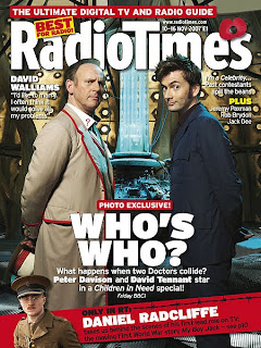
 Here we have an issue 'RadioTimes' magazine. The first thing that catches the audience's attention is the headline of 'WHO'S WHO?', this added with the image of Peter Davison and David Tennnant tells the audience this week's main feature is about 'Dr Who'. Underneath this headline is a caption, informing the audience more about what is happening, when it's happening and which channel it's on. The two men arestood one on each side of the page, mirroring each other and are in similar positions. 'Dr Who' fans will recognise the background as being the inside of the tardis, giving the audience something to relate to better than just having a plain background. For those members of the audience who don't recognise it, the darkness and unusual-looking background could bring about a sense of mystery, suspense and action.
By making the title bold and white, it really catches the audience's eye and makes it recognisable, creating brand identity. The use of the poppy flower tells us this is the November issue, supporting Rememberance Day and giving a kind of patriotic feel all round.
The way everything is laid out is very organised, only over-lapping when needed to highlight the more important features. Using bold colours such as red and yellow to catch the audience's attention and draw their eyes around the page. At the bottom of the page is a strip of red containing another feature on Daniel Radcliffe, with all the writing going diagonally and the image of him in a soldier costume, telling us more about his role.
The magazine has an overall professional feel to it, highlighting aspects in a simple and clear manner.
This magazine subverts the conventions of current tv magazine covers as it has an image as it's background, unlike the conventional plain, brightly coloured background. This makes it more interesting and informs the reader it's about a specific narrative or show. However the font used is big and bold, capturing the audience's attention right away and lets them know what it's about.
The layout is focusing mainly on the two characters, with them both centered to show their importance.
No comments:
Post a Comment