Monday, 16 November 2009
Audience Feedback
We were told that our music was too loud and that it made it seem more like a music video.
We resolved this by lowering the music and and selecting certain parts from the soundtrack to cut out.
We also had to slow down the beginning, showing more of the area and include shots of the area throughout the trailer, relating back to Warwick Avenue. Adding effects to our trailer made it appear more professional with a higher quality of work and more appealing to our target audience.
We were told our storylines weren't very clear and it was hard to understand what was going on, some being too short and some shots being too long but with no real meaning, so we had to edit our storylines to flow better and tell the narrative better.
Our ancillary tasks weren't understood well, with many people commenting that they didn't go together well enough or show any special effects. So we decided to change the poster completely and to fix the magazine front cover by adding more colours, effects and making it stand out more. The poster before was too busy and didn't really explain the storylines the way we wanted it to so by changing it, making it simpler yet still get across our soap.
Our feedback on our final product was that all three tasks had a great sense of brand identity and worked well in relating to our target teenage audience.
Thursday, 12 November 2009
Magazine and Poster
Because our soap trailer is aimed at a younger audience and is about teenage life we decided to make them a bit more playful and not too serious. The poster and magazine has the same dreary backgrounds which fade in using Photoshop and Indesign, showing that they think they are living in a dream but, when the audience watch the trailer most of them will connect with it and see what problems are going on from a different point of view and that they are not alone.
Because everyone knows Warwick Avenue is not very posh and we filmed all our shots within this area, we decided to play with this idea and make the word Warwick Avenue in a posh font (Zapfino), it adds humour with a little twist. We put the actual area for the backgrounds of both this is for the people that do not know where Warwick Avenue is and I think the gist of it works out and makes it look professional but also unique.
The main colours that are used is black and white, these colours show love. danger, evil alone which is what the soap is about. On the mag we put the main characters with the main story bigger than the rest to catch the readers eye, the same was done for the poster putting the characters together on how they appear in the soap trailer. Also did this in the trailer not mixing the characters in anyway making it nice ans clear for the audience.
Tuesday, 10 November 2009
Editing
After watching our footage we realised we had some scenes missing and it was difficult to tell what was going on in the soap without them, so we can go re-film certain parts to achieve continuity.
Unfortunately many of the characters were unavailable to re-shoot these shots so for some parts we had to change the actors and get rid of an entire storyline, however this didn't disrupt us too much and we were able to continue with editing without any problems.
After sorting the shots into storylines and editing out the useless parts, we then had the difficult job of bringing these storylines together in a way similar to current soap trailers. We had to make sure the storylines were still clear and easy to understand even when there are multiple plots, but also for the trailer to flow well as a whole. This was sorted out quickly and we swiftly moved on to making our trailer more look and flow better.
This was done with the help of effects, we chose the effects which made our soap trailer seem more like current soap trailers, following certain forms and conventions. Effects such as split screen and motion path made our soap appear more interesting and modern, relating to our desired target audience of teenagers. Using the split screen we were able to link our storylines and help the audience understand what is going on better, such as the love triangle between Ali, Darine and Mohammed. We also used a split screen for Dammy's shot showing us two different views. Other effects used were to make the trailer more appealing to teenagers and in keeping with our storylines.
We chose to use an original soundtrack, however we didn't want to make it appear as it is is a music video so we had to edit the soundtrack at certain parts, lowering the volume and bringing it up at other parts. We wanted it to be a catchy yet work well in conveying the area and adding to the storylines, so we chose to use a song with a strong hip-hop feel to it, bringing a street feel to the trailer and helping to relate better to our teenage audience.
To finish with we had to add a voice recording stating when and where our soap will be shown, this was very straight forward and easy to do, choreographing it well with the titles and production logo. This was the final step and we were very pleased with the finished product.
Monday, 9 November 2009
Filming
Today we had to wait untill after school to film because we needed to get a boy into the girls toilets and this can only be done after school and when Adam and Louena had free time. The recording went well, and the echo in the toilet works well adding to the realistic feel. The ariel shot was a bit fiddly but it worked out in the end after a few shots.
Friday, 6 November 2009
Filming
Today me and Insaf planned to go film the cafe storyline where the same girl i filmed at my house would try steal a coke can. We shared the equipment between us as it was more manageable. Insaf asked her uncle if we could film in his cafe at Queens Park still keeping it around the area. It worked very well as there was not a lot of customers if any at this time around 4 o'clock. Plus, it as very spacious and the lighting didn't need to be adjusted.
Thursday, 5 November 2009
Filming
I had to record a small part in my house taking all the equipment home this wasn't much of a hassle as i live 10 minutes next to the school. As my initial actress let me down i just moved to the next as there was no time to waste. Recording in the corridor to the kitchen went smoothly as there was enough efficient space to maneuver and keep the story line in tact. Furthermore, because the house was so quiet the sound was perfect keeping up with the realism.
Wednesday, 4 November 2009
Filming
Location

 Filming in the toilet makes the soap look more fun and dramatic, especially in the school toilets furthermore, when the characters talk the sound is nice and clear and kind of echos to add to the dramatic feel.
 We shot the story line with Ayla (actress), I chose my house to film in because it's close to the area and so it's less time consuming and also keeping the brand identity (Warwick Avenue). Furthermore, it was an efficient place to use the camera movements and angles that i needed for example the panning which worked out nice and swiftly.
 Tuesday, 3 November 2009
Broader overview
Throughout, we will have a range of characters different from each other keeping up the individualism which teenagers should have, it could make them think about it while watching it. Some will be mischievous, quiet, sly, funny, goths(something that every school has) plus from research of other soaps I've seen this. Story lines are going to be inspired by other soaps; Hollyoaks and Grange hill mostly because they are my favourite and most dramatic but we will make them our own, always leaving the audience with cliffhangers to keep them interested and wanting to watch more. The story lines will still be aimed at teenage life but will have other age groups coming in for further realism.
Tuesday, 20 October 2009
Magazine- Draft
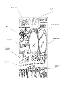 This is the rough draft of our TV magazine front cover, which we have chosen to use the conventions of other magazine front covers to guide us and make our magazine follow the forms of current front covers.
Poster- Draft
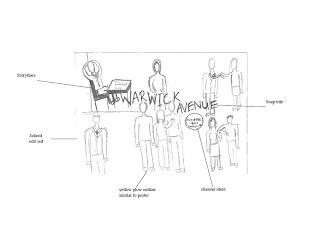
We decided to include all the characters in this poster to get the audience familiar with them all and to give them all a chance to connect better with our target audience. We also chose to keep all the storylines separate and not to mix up the characters so as to help the audience get a better understanding of who is who and what is going on. We will use similar colours in the magazine and the poster to keep the brand identity and make it bright and vibrant to draw the audience in.
Thursday, 15 October 2009
Script
Wednesday, 14 October 2009
Warwick Avenue- Storyboard
This is our story board for our soap trailer, by doing this before actually recording the soap it helps us think out our ideas clearer and work out what camera shots and angles we will use instead of doing is last minute. Plus, if the shots/ angles do not work out alterations can be made at the time of filming.
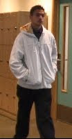
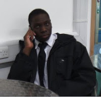
Chararcters and Costumes

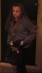
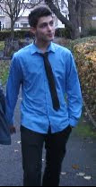
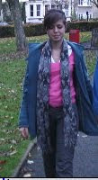
Tuesday, 13 October 2009
Costume & Props
Sunday, 11 October 2009
Location
Overall, we are trying to make every part of the trailer look youthful and modern for this time, to make it more interesting and attracting our rage of audience. I was inspired to mostly to film at school from Hollyoaks it works quite well, furthermore I was inspired to use close locations round the area for example Warwick for my soap from Skins, it just looks more middle class as it is what the area is all about.
Wednesday, 7 October 2009
Story Lines
Story line 1
This will be set in the school toilets, there will be a girl and a boy up to some funny business however, this will not be shown. The boy walks out the cubicle not showing his identity and he says "I think we should keep this between us." He walks out and the girl is left alone sitting on the toilet sit angry about what just happened.
Story line 2
There is a girl and a boy walking walking at night time at Paddington Rec holding hands. The boy says to the girl "i need to tell you something." The girl is staring at him in disapproval... he continues "I think I'll be happier single" the girl replies softly but with a bit of grit in her voice "After everything." In slow motion we see the girl letting go of the boys hands and running off upset with her scarf over her face.
Storyline 3
A girl that just came back from school finds her house empty when she got home, there is a note on the fridge written by her mum; "There's food in the microwave (more modern) don't know when I'll be back."
Story line 4
A boy is doing an exam all by himself in a class with a male teacher supervising. The teacher is about to walk out the class "I will return in a few minutes," the student looks like he is struggling so he gets up with no hesitation and walks out.
Story line 5
The same character that arrives home to a empty house is stealing food from a corner shop.
Story line 6
The girl is at home calling her boyfriend and her boy friends is at his house with another boy and ignores her call turns to the boy and looks at him.
Tuesday, 6 October 2009
Music Choice
We decided to choose this type of music as it has a young feel to it, it is all about problems that teenagers have between thier parents, siblings and mostly love. I think the trailer would work quite well with this sound track making the moving image connect to what is being said in the song. Having two types of conventions in a trailer will make it look more interesting and catch more attention to encourage the audience to watch the soap. The song is unique and unreleased to it will be something new to hear furthermore it it modern performed by talented teenagers.
Monday, 5 October 2009
Production Logo

Target Audience Profile
Around 60% of students asked said their favourite soap was 'Eastenders', telling us that the majority prefer real-life situations, based around real environments. However many would also prefer to see more action, romance, drama and teen-related storylines.
We would like to aim our soap at 15-19 year olds and by giving them a new soap with drama and storylines revolving around teen lives, hoping it would appeal to them more then the current soaps which are mainly aimed at older people. We have set our soap mainly in school and around the school area: Paddington Rec and Warwick, again relating to teenagers, where life mostly revolves around school, friends and family.
Wednesday, 30 September 2009
Questionnaire
2) What features would you like to see in a soap?
3)Do you think there are enough t.v shows/soaps aimed at teenagers?
4)Would you like to see a soap based on a urban background?
5)What is the most important feature for you to encourage you to watch the soap?
6)What type of characters would you like to see?
7)What story line would interest you?
Thursday, 24 September 2009
Radio times Magazine Issue
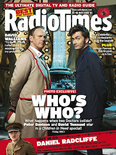 Here we have an issue 'RadioTimes' magazine. The first thing that catches the audience's attention is the headline of 'WHO'S WHO?', this added with the image of Peter Davison and David Tennnant tells the audience this week's main feature is about 'Dr Who'. Underneath this headline is a caption, informing the audience more about what is happening, when it's happening and which channel it's on. The two men arestood one on each side of the page, mirroring each other and are in similar positions. 'Dr Who' fans will recognise the background as being the inside of the tardis, giving the audience something to relate to better than just having a plain background. For those members of the audience who don't recognise it, the darkness and unusual-looking background could bring about a sense of mystery, suspense and action.
By making the title bold and white, it really catches the audience's eye and makes it recognisable, creating brand identity. The use of the poppy flower tells us this is the November issue, supporting Rememberance Day and giving a kind of patriotic feel all round.
The way everything is laid out is very organised, only over-lapping when needed to highlight the more important features. Using bold colours such as red and yellow to catch the audience's attention and draw their eyes around the page. At the bottom of the page is a strip of red containing another feature on Daniel Radcliffe, with all the writing going diagonally and the image of him in a soldier costume, telling us more about his role.
The magazine has an overall professional feel to it, highlighting aspects in a simple and clear manner.
This magazine subverts the conventions of current tv magazine covers as it has an image as it's background, unlike the conventional plain, brightly coloured background. This makes it more interesting and informs the reader it's about a specific narrative or show. However the font used is big and bold, capturing the audience's attention right away and lets them know what it's about.
The layout is focusing mainly on the two characters, with them both centered to show their importance.
Tv Choice Magazine Issue 42

Wednesday, 23 September 2009
TV Choice Magazine Issue 40

Tuesday, 22 September 2009
Desperate Housewives Poster
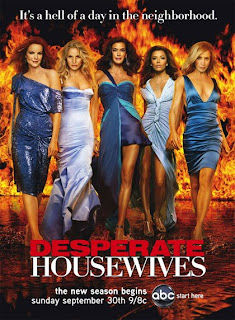
Here we see a poster for the new season of 'Desperate Housewives', using all 5 main characters together, all standing at an equal height. Even though Eva Longoria, for example,is really short in real life, she has been altered to look like she's of similar height as the others, giving them all an equally powerful status. Together they convey authority and break through the stereotypes of women being the weaker sex, becoming incredibly symbolic in America and many other western countries. They are all very glamorous and appeal to a more female audience.
They are all wearing blue dresses, connoting a sense of femininity. Also all the dresses are different, which could suggest every character's different, and has their own style or way of thinking, even though they are in a close group of friends. As well as this, they are wearing different shades of blue, using these complimentary colours to reinforce their sense of unity. Blue is seen as a calm, cold colour, this contrasts against the fiery background. Fire connotes danger or anger, an the fact that they are wearing a cold colour, suggests they are in control of the situation and in control of their lives.
The caption at the top of the poster saying 'It's a hell of a day in the neighborhood' is a play on words with the background, which is fire/hell. This also suggest that living in this neighborhood isn't as easy as it looks.The use of dark background against the fire and the contrasting characters really brings them out and immediately catches your eye.
The title really stands out and by making the word 'DESPERATE' red and in bold, capital letters is makes the word more powerful. The fact that the word 'HOUSEWIVES' is written in simple, white font could suggest that it's complying with the stereotypical suburban lifestyle, that everything is perfect, the men work whilst the women stay at home and look after the children etc. Also suggesting that the characters comply with certain stereotypes linked with suburbia
This poster conveys a glamorous feel overall, but also shows female dominance and power. Their unity appeals to the female audience members and show they are a force to be reckoned with.
Finally the channel ident for abc at the bottom of the poster tells the audience where to watch it, this helps to promote the abc channel as well as the program itself.
This poster follows the conventions of soaps and dramas as it is higly dramatic and glamorous, which helps to catch the audiences attention. However this also subverts conventional posters as many do not include an all female cast, showing strong and empowering women on posters to attract their target audience of women. The use of bright, vibrant colours is instantly eye-catching and is used in many posters to draw in the audience. The font is kept very simple and the play on words is very common in posters, to engage with the audience as well as humoring them.
90210 Poster
 In this poster we see all the main characters standing tall and proud of who and what they are, also they are all shown at equal height furthermore, they all are good looking and made to almost look perfect. This i think is aimed at younger people as they all would be thinking that they would want to look like that plus, making them attractive will attract the opposite sex even if they don't know what the soap is about.
However, it is shown that 90210 is mostly about young 'love' or 'fun' life seeing it from the boys and how all of them are young. At the back there is a older women there, just as if she's there keeping an eye on them. Plus, there's a slightly younger women but still older than the rest trying to look as good as the teenagers standing on front with authority.
Also, putting 90210 right in the middle it just wouldn't bee unseen. It used to be an old show which was very popular and sold global the rankings on the radio at that time went over the roof with votes. Now it has been repeated again, of course it will have to look bigger and better for the old audience but also attract the new. Because it is such a expensive well known place in Beverly Hills , the people look so glamorous that they are glowing with smiles on their faces not showing what's going on behind the story lines as the audience will have to watch the soap to know what is 'really' going on.
The background is pink which shows that the soap is aimed mainly at females which could be because the rich, glamorous lifestyle appeals mostly to girls. In this poster they are trying to create a particular lifestyle making the teenagers think they want to be them also, having the glow around them suggesting that they are shinning like a diamond or almost like they are the superheros to make the word boredom vanish they are 'living the life.'
This lifestyle that they are creating seems to be everything a teenager could want, looks, glam, money,happiness, friends, fun all this is interpreted differently by each person that looks at this poster depending on what they 'want' that is why it is important for each feature to be put there for a reason.
The bright colours and glamorous characters is very conventional as its something every company would use to attract the audience, 'want to be like them' so making use of escapism. The layout is very basic not a lot is going on, because of this the protagonists have to look phenomenal still keeping the audiences interest in hand. Also rounded edges on the font is used for when 90210 is showing, keeping it friendly, kind, 'cute' this could be representing something the audience would envy.
Hollyoaks Poster
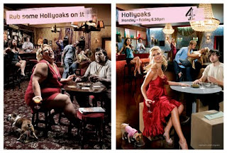
Here there is a poster advertising Hollyoaks, there is a lot of amusement in this, a play on words is used on the top to convey the photo furthermore, as I've noticed the colour pink is used a lot aiming at a female audience, also connecting to the photo as there is also a women on the cover. however, having a women on the cover doesn't necessarily mean it is aimed at women but could also attract men when looking at the right side.
Underneath this caption the photo is all grim, dull, old and also quite amusing. These two photos are identical with a great use of editing added, the point that is being put across is the Hollyoaks puts the glam in life and everything just looks better, and if everything looks better then why wouldn't the soap be better? Playing with the idea of spot the difference.
On top of the other photo there is the exact caption contributing with the Brand identity but with the channel indent this time, because this is the 'real' Hollyoaks, and the day and time to give further information for interested viewers.
I think the soap has been promoted well by poster still keeping the amusement there is in trailers, and also aiming it more at females as there is a higher rate of them watching the soap.
If you concentrate on the dog on the left it is big and fat something that is stereotyped for a man to own. In contrast on the right side the dog is a chihuahua and this time it would be a dog that a women would own also a celebrity putting glam into Hollyoaks making their lifestyle on the soap seem more interesting especially when put next tot he opposite. Plus, the right looks far more civilised aiming at a wider rage of audience even better the left could also represent someones lifestyle which could attract them to watch the soap to seewhat a 'better' life is. The right is more like a restaurant than a pub, could also be making fun of other soaps keeping the glamour in Hollyoaks.
Here we see a convention that is used very frequently; having the audience want to be the characters in the soap, or even relate to the story lines, costume, lifestyle. This is a clever way of appealing to a wider range of audience even thought this poster is aimed at women in particular, men could also be interested in ; good looking women, something that they might look idol for their own girlfriend/ wife to be.
Hollyoaks analysis
The opening shot is quite interesting it is layed out like a magazine comic book with The words Love Triangle showing the three characters involved in the series, this has been done purposely as if something is being reported but in a jokey way 'making fun' of the event. Each of the the characters have a say on their 'issue' there is no other music going on and to give more of a twisty feel the whole magazine starts spinning.
A loud soundtrack starts playing by Blur called Girls and Boys this was a popular pop British song in the mid 1990's. It's all about girls, boys and young people and how they have fun going out messing around. This soundtrack contributes with the story lines that are being shown in the trailer.
There is a quick cut filling the whole screen all segregated boxes showing story lines, the camera is not steady it moves to the right to each box waiting for the moving image and carry's on. At one point there is a thought bubble as there is no dialog like a convention of cartoon's "I can't think about Kris" on the two different people this puts amusement in the trailer but also makes the viewer concentrate on what is being shown because they will have to read what the thought bubble says the get the full picture.
Moving on at this point there are devastated faces in the 'cartoon strips' put together but all broken up on the sides just like a broken heart, or a broken ending. After the camera moves down to the left showing behind Nancy's head with Kris and Ravi in the background with a caption 'Share the love' then to the right it shows her face to see her emotion with a caption 'feel the pain.'This gives the viewer an idea that its Nancy 'getting it back,' however the full story isn't shown almost like a cliffhanger leaving the viewer wanting to see more.
At this moment the soundtrack has a lower volume and there is a voice over, while the screen changes to whole with Nancy's face showing through the Channel 4 ident, emphasising that she is the main 'trouble maker' of this series in the soap.
Overall, there was a comedic feel to this trailer aiming to keep the viewer amused, and laughter brings happiness, it would keep the viewers attention on the trailer and get them interested in watching the soap. From the Hollyoaks trailers I've looked at most of them are funny, however the Eastenders trailers look more fun, but if not that they are a lot more serious.
Monday, 21 September 2009
Eastenders Trailer - Mitchell Sisters
It opens with a popular dance song, 'Girls' by Calvin Harris, slowing building up. We then cut to many different shots of well-known 'Eastenders' characters in a pub, all slowly moving, one by one,to look at something which the audience cannot see yet. The lighting in the scene is very flashy , which is very different to the typical 'Eastenders' lighting, which tends to be more realistic and not very exciting. This brings a sense of change to the show and makes it more appealing to maybe younger generations. The younger characters appear to be having fun, laughing and drinking, making it appear more welcoming, whereas the older characters look abit embarrassed or shocked, suggesting that what they are looking at is not, in their minds, conventionally moral.
It then cuts to a blonde woman wearing a red dress, the red connoting she's vibrant and outgoing but could also be dangerous. She's behind the bar and as she takes the money we hear a cher-ching, which is very comic and is intended to be humorous, amusing the audience. The shot then pauses for 2 seconds, during this time a caption saying 'Ronnie Mitchell' flashing up in lights at the bottom right corner of the screen. The caption is flashy and fancy, similar to those on gameshows , this presents this character and elevates her status.
She then points, drawing our eyes and the camera to a second character, who again is a young blonde woman, wearing a cowboy hat, connoting she's in charge or she doesn't take orders. There is another caption, in the same fancy style as the previous, saying 'Roxy Mitchell', introducing the character to the audience. We then cut to shots of other characters again, showing their reactions or thoughts of these two new charcters, some having fun and joining in, whilst others look on disapprovingly. However this is all done in a very comic way, intended to be funny and makes the audience join the fun. It then cuts to many shots from different angles showing Ronnie and Roxy dancing, laughing and spraying the characters with drink. The various cuts shows the action from many angles, making the audience feel more involved in what's happening.
The final shot is of Ronnie and Roxy dancing again, but this time the shot is abit longer, giving the audience more time to concentrate and focus of these two new characters, a caption comes up at the bottom of the screen saying 'The Square Under New Management', suggesting change.
It ends with the typical 'Eastenders' score, which never fails to create drama.The closing shot is of a black screen with the caption 'There's more to Eastenders', this final line hooks the audience, and with their website appearing underneath it they know exactly where to go to see what happens next.
This trailer is very fast-paced and follows the conventions of upbeat trailers, attracting the audience with fun, playful music. Like most of the Eastenders trailers it follows a single narrative, giving the audience a better chance to get to know individual characters and connect with their stoylines better. It has also been hyper-dramatised and made almost surreal to give a fast, upbeat feel to it, developing on the forms of current soap trailers, aiming to create an appealing and interesting trailer for the audience.
Hollyoaks Analysis
The Hollyoaks trailer begins with a straight on wide opening shot of a character in Hollyoaks plus, the sponsor of Hollyoaks is in the corner as far as i now it is there straight through for advertisement catching the viewers eyes.
A quick cut is used to a different story line with a voice over "Love Hollyoaks" then the character says "yes" this is a play on words keeping up funnies as it is aimed at teenagers, a great use of editing. The music in the background is a few guitar strings with a upbeat, quick continuous rhythm. There is another quick cut almost like a flash of another character followed by another the voice of still talking a strong voice is used with a comedic feel to it adapting to the fun trailer.
There are many other quick cuts with different characters and story lines always using a wide shot, looking at this it gives me some ideas for my own trailer seeing the spontaneous use of editing all blending in and making sense. Half way there is a quick cut to the channel indent reminding the viewer or a new viewer, followed by another cut to a story line giving a little amusement, to another quick cut whole screen "5 nights" to emphasis the words. Thus juxtaposition is used well not confusing the viewer just not letting them get bored.
This time the voice over is connected to the story lines on the screen describing what is going on just like describing what is going on in a story book making it more interesting, furthermore still keeping amusement on a high. There is a quick cut wide shot of a car racing then, a close up cut to the character inside the car seeing the facial expression just as the girls eye shows to show her identity to the viewer it cuts to another storyline, this is building up tension and making the viewer curious wanting to know what is going to happen next, also the speed of the car is equal to the speed of the editing (cuts).
Near the end of the trailer some of the story lines are being repeated showing a little more glimpse as from now we can read the viewers mind as they do want to know what is going to happen next. The voice of is still going on as he says "Hollyoaks Later" there is a quick cut to a character framing him on the right side leaving space for the writing labels to appear having the voice over still say them out "starts on the 25 November on E4." Futhermore the channel indent is put shown extra big with bubbley writing once again still keeping the fun and the modern young feel to the trailer. Plus, another use of advertisment would be the address of the website on top of the mans head aiming at a wider range of auidence.
Wednesday, 16 September 2009
Eastenders Christmas Trailer
We open with an animated 'BBC One' channel ident, bringing a Christmas feel with snowballs being thrown at the screen.
We start off with a popular Christmas song as the soundtrack, 'Winter Wonderland',while shots of well-known 'Eastenders' families show everyone together, fading in and out into different families, showing friends and families joint in celebration at Christmas, laughing and joking with each other whilst having Christmas dinner, creating a cheery atmosphere. The mise-en-scene is all very Christmasy, mistletoe,tinsel and wreath everywhere, with characters wearing Christmas hats and pulling crackers. During this time, the 'BBC One' logo has appeared at the bottom of the screen, keeping in line with their brand identity.
It then fades into a family in a pub, all gathered around the table, cutting to shots of all of them from different angles of them pulling crackers together as a group, still conveying a sense of happiness and joy. Suddenly the music starts distorting, slowing ending altogether. The colour starts fading from bright to grey and the camera cuts to a close up of the man's hands pulling a piece of paper out of the cracker. A voiceover then says 'Who's the Daddy....The truth is out', whilst we fade from shots of the paper, to his shocked face and of other character's reactions. This has definitely created a lot of drama and a tense situation, keeping the viewers hooked on what will happen next.
It ends with a fade out from a zoom into the man's face, looking shocked and betrayed, finishing off with the typical 'Eastenders' score, that they always end with. Finally it cuts to the channel ident, again carrying on the Christmas atmosphere with snowballs and snow.
This trailer follows the conventions of current soap trailers as it is very dramatic and contains many of the well-known characters. However by having a slow-paced atmosphere, with a slow soundtrack it subverts the forms of usually upbeat and catchy trailers which work better in keeping the audience interested. Also it is common for soap trailers to have mutliple narratives, whereas here we have one main one, all revolving around the christmas storyline. This is different and makes the audience focus more on this narrative and it's characters.
This trailer follows a linear structure in which all the storylines run in order, this somewhat subverts the conventions as trailers tend to be non-linear and bring in storylines regardless of when it is actuallly happening.

